Have you held a new five pound note in your hand yet and taken a good look at it? I have: in a word, YUK! I have no problem with the fact it’s a polymer note. The Australians have had plastic money for over twenty years and other nations more recently also. My quibble is the design.
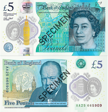
The images above, as seen on my computer screen, are flattering: in real life, the contrast is reduced and the overall impression is of a blue-grey sludge, particularly on the font. Think of some mould that’s grown over something in the fridge you should have thrown out weeks ago. Or think of some image or sign left out in the sun and the picture and colours have faded.
And just look at the typography and calligraphy. The bold “5” has disappeared, as it did when the £20 note was last changed. That, the fussy typeface and the low contrast all make life more difficult for thousands of visually impaired people. All those squiggles look like the work of a very bored six year old in a school writing lesson.
Apart, of course, from the faces of the two individuals portrayed, the note looks like it could have been designed at any time between the fifteenth century and the 1940s. In fact it’s worse than that, as early 20th century movements such as art deco had a lasting and wide impact on modern design principles.
Good Design
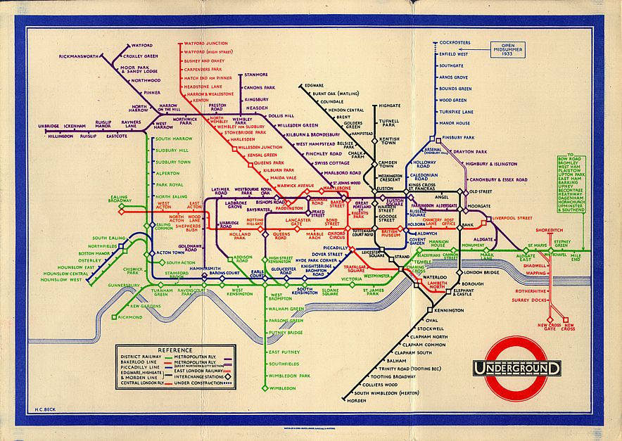
The UK is a world leader in good design. In diverse fields such as the arts, architecture and everyday household objects, we’re world class. For example, the London Tube Map, first published in the 1930s, is a design classic. The Design Council has been doing an excellent job for 70 years encouraging good design and new designers. It estimates that’s worth £71 billion a year, or 7% of the UK’s income (Gross Value Added to be technical). That’s nearly as much as the much valued (by politicians) financial services sector.
Despite some internet research, I’ve not yet found any information telling me who was responsible for the design: certainly, the Design Council’s website search facility draws a blank. Whoever they were, they seem to be trapped in a time-warp bubble which significantly pre-dates the 21st century. The Bank of England does have a “Banknote Character Advisory Committee” (yes, really!) who are responsible for advising on which people’s faces appear on new banknotes. This Committee is reasonably diverse in its membership, which offers some hope. But for the actual design, does anyone know?
Oh, and one last thing: it should have been a coin.